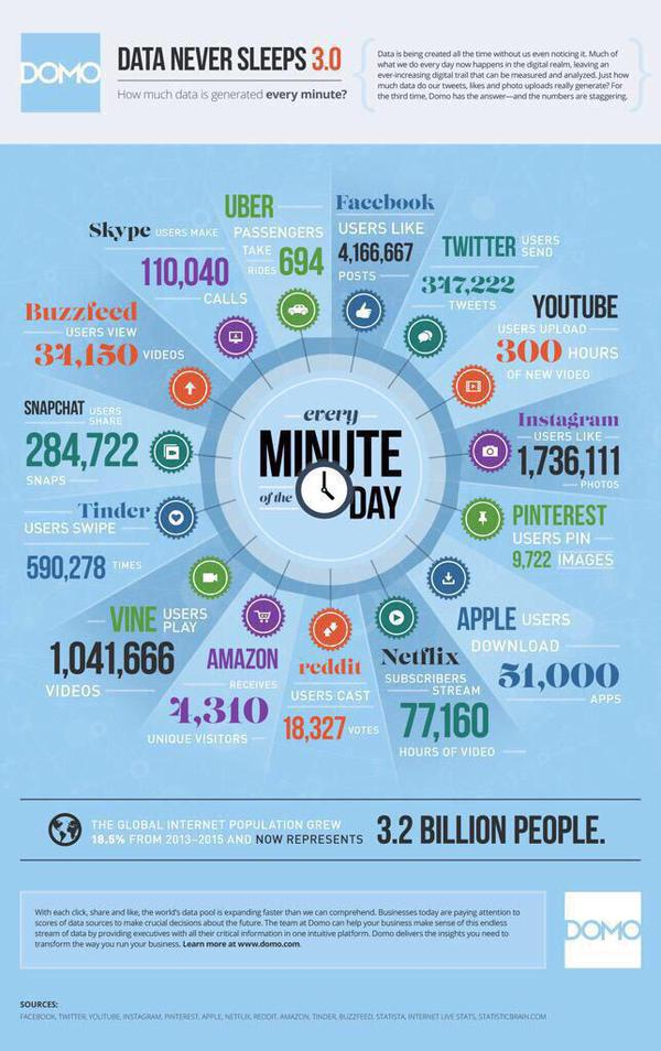
This is a new infographic from Domo showing what happens every minutes relating to services like Twitter, Facebook, Instagram, Uber and so on.
I generally hate infographics - badly sourced, out of date, irrelevant etc - but this one is good.
See it here - created in mid August 2015
No comments:
Post a Comment